Communication is best when the message is clear. That means the message and delivery must be carefully executed. Where a message is being delivered visually, type and movement are very important.
Type is crucial. Nobody is going to take the time to decipher a message that may be difficult to read at first glance. Although certain fonts may be associated with a logo, clear fonts are the safest way to deliver a message. It's essential to consider the people who may not speak English very well. Therefore, fonts that clearly show the letters and are clean of any "extras" is the best way to go.
Movement is vital as well. The way somebody moves may send a message to somebody else. For example, someone may make a fist which usually shows that they're angry. Movement could show more than anything that could be written or said. Also, let's not forget about sign language! Which I believe is a strong example of visual communication.
I feel many anti-bullying posters have a great sense of visual communication. For example these posters:


The type is clear and in bold which makes the text heavy and immediately draws attention to the words. The size of the type is nice because it doesn't overpower the images. Colors impact the way the message is delivered, red being the severity and importance of the issue, and black and white to contrast.
Usually anti-bullying posters use images that may impact the viewer by making them feel sorrow or inspired. These posters catch my eye every time, and the message is always the same yet executed differently. (Again, written and visual communication together create a strong message.)
Apple has strong visual communication with their logo. Not only is the image associated with the word (so you can never forget!) but the logo is consistent. Anything marked with this:

whether in black or grey, if you're familiar with the brand or product, without a thought you'll know that it's a product of Apple. This, I believe, is the smart way to brand a product. Keep it consistent, clean, and clear.
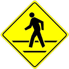
Lastly, I believe traffic signs have strong visual communication. It's common to know that the green light means to go, the red octagon means to stop, and yellow signs refer to caution and awareness. The rules of the road are communicated with drivers through shape, color and design. Sometimes there's type such as STOP or DETOUR but, again, the type is clear and bold for an easy, clear delivery of the message. The signs are also consistent, for example, stop signs are always red octagons.

