Beautiful Design, Beautiful Poster.
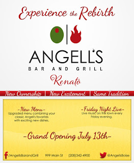
First, let's look at the spacing. The top is centered while the bottom is balanced. The type isn't consuming all of the white space on this poster, which allows breathing room.
There are only two fonts used (excluding the name of the restaurant), which makes this poster visually flow and it makes the poster appealing. The cursive sends an elegant vibe to the viewer while the plain font gives an opposing simplicity feel. The fonts complement each other.
The colors aren't overused and go well together. The green from the olive and red from the flame are complementary to each other. Using the red throughout, as a small menu bar, as a font color, and coloring the social media icons, makes the information stand out without overpowering the other words.
The social media, contact information, and address are clearly presented at the bottom, making it easily accessible.
Subtle things also give some flare. The light line that runs through "-Grand Opening July 13th-" and the white lines that separate "New Ownership", "New Excitement", and "Same Tradition" adds some visual appeal.
From top to bottom this poster flows. It has all of the necessary information without any "extras" and nothing is crammed or mushed together. Overall, this is well designed.
This poster is very cute and designed very well!
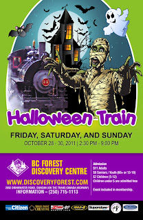
The purple and green give a playful, fun feel to this poster and is carried throughout the entire page. The purple is not only seen in the main event title and at the bottom as a background, but tints the train in the photo above! The green is seen not only as background at the top, but in the mummy. The yellow type stands out nicely without conflicting with the purple background and subtly highlights beneath the words "Halloween Train" and appears again in the windows of the castle. The color consistency in the poster is great!
The information is nicely spaced out. The use of lines and color separation gives a more organized presentation of information.
The black solid bottom for the sponsors looks clean and well presented.
Various font sizes presents the information nicely, giving the main information (large size) the main attention of the viewer, and the details (smaller font) for if the viewer chooses to read more into the event.
Other small details such as the white highlight around "Halloween Train" and around the photo itself is a cleaner, more prominent way to highlight to catch the viewers attention.

Sometimes, there really is beauty in simplicity.
The use of only two fonts is always a plus! The fonts are clear to read and with one being a serif and the other being a sans-serif, we see a little contrast but they look well together. The size of the fonts are nice because the title of the event isn't too big where it fights for attention with the image. The title sits comfortably below the image, with the details of the event below the title in a smaller, yet good sized font.
Image wise, the stars aren't over used and doesn't cause a distraction, but more as a cutesy detail (as it should!). It touches upon outer space and what the winter solstice really is. There's also balance on each side of the vertical line that sits between the groups of stars (four on the left, four on the right). The circle, which can either symbolize an ornament or a globe, being centered, is the first thing to catch the viewers eye. It's what first draws the viewer in.
Layout wise, the information is well organized and easy to find. The fact that the details aren't centered and sit to the right of the page balances out the icon/logo of the company that sits to the bottom left.
Little things, like how the border looks like it's dangling the ball, is visually appealing. It all flows together. Even if the viewer's eyes don't follow that long line of light blue (or purple), it is seen again inside the ball. Not to mention that the line at the bottom is only slightly to the right of where the side of the larger line would be if it continued to the bottom. In a way, the top line is almost a guide line to lead the viewer's eyes down to the information and the "information line".
This is a well presented, simple poster.
Terrible, Terrible, Terrible.
Beautiful Design, Beautiful Poster.
First, let's look at the spacing. The top is centered while the bottom is balanced. The type isn't consuming all of the white space on this poster, which allows breathing room.
There are only two fonts used (excluding the name of the restaurant), which makes this poster visually flow and it makes the poster appealing. The cursive sends an elegant vibe to the viewer while the plain font gives an opposing simplicity feel. The fonts complement each other.
The colors aren't overused and go well together. The green from the olive and red from the flame are complementary to each other. Using the red throughout, as a small menu bar, as a font color, and coloring the social media icons, makes the information stand out without overpowering the other words.
The social media, contact information, and address are clearly presented at the bottom, making it easily accessible.
Subtle things also give some flare. The light line that runs through "-Grand Opening July 13th-" and the white lines that separate "New Ownership", "New Excitement", and "Same Tradition" adds some visual appeal.
From top to bottom this poster flows. It has all of the necessary information without any "extras" and nothing is crammed or mushed together. Overall, this is well designed.
This poster is very cute and designed very well!
The purple and green give a playful, fun feel to this poster and is carried throughout the entire page. The purple is not only seen in the main event title and at the bottom as a background, but tints the train in the photo above! The green is seen not only as background at the top, but in the mummy. The yellow type stands out nicely without conflicting with the purple background and subtly highlights beneath the words "Halloween Train" and appears again in the windows of the castle. The color consistency in the poster is great!
The information is nicely spaced out. The use of lines and color separation gives a more organized presentation of information.
The black solid bottom for the sponsors looks clean and well presented.
Various font sizes presents the information nicely, giving the main information (large size) the main attention of the viewer, and the details (smaller font) for if the viewer chooses to read more into the event.
Other small details such as the white highlight around "Halloween Train" and around the photo itself is a cleaner, more prominent way to highlight to catch the viewers attention.
The use of only two fonts is always a plus! The fonts are clear to read and with one being a serif and the other being a sans-serif, we see a little contrast but they look well together. The size of the fonts are nice because the title of the event isn't too big where it fights for attention with the image. The title sits comfortably below the image, with the details of the event below the title in a smaller, yet good sized font.
Image wise, the stars aren't over used and doesn't cause a distraction, but more as a cutesy detail (as it should!). It touches upon outer space and what the winter solstice really is. There's also balance on each side of the vertical line that sits between the groups of stars (four on the left, four on the right). The circle, which can either symbolize an ornament or a globe, being centered, is the first thing to catch the viewers eye. It's what first draws the viewer in.
Layout wise, the information is well organized and easy to find. The fact that the details aren't centered and sit to the right of the page balances out the icon/logo of the company that sits to the bottom left.
Little things, like how the border looks like it's dangling the ball, is visually appealing. It all flows together. Even if the viewer's eyes don't follow that long line of light blue (or purple), it is seen again inside the ball. Not to mention that the line at the bottom is only slightly to the right of where the side of the larger line would be if it continued to the bottom. In a way, the top line is almost a guide line to lead the viewer's eyes down to the information and the "information line".
This is a well presented, simple poster.
Terrible, Terrible, Terrible.
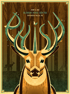
Oh deer.What is going on here?
It's hard to know what the message of this poster is. Because there's a date and a location, it's safe to assume that it's an event? But where can the viewer find more information when there isn't a phone number, email address, or social media link?
Also, the picture itself shows it's a cross breed between a unicorn and a deer? Is it their logo? Their icon?
Looking past all of that, the colors are the best part of this poster, each harmonizing with each other beautifully. The consistency of the color throughout is what makes this poster appealing, and using a unique border with these colors complement the inner content. Even the placement of the information is decent because the horns guide the viewer's eyes right to it. It's also aligned with the face of the animal, making this balanced from left to right.
But this is still a bad poster just because of the information it lacks. There could be many reasons why a music center would create a poster; a promotion, new location, a sale, etc. It leaves the viewer with too many questions as to why it exists at all.

Where to begin?
TOO. MANY. FONTS. There are five different fonts used on this poster. One is the logo of the company, and two are possibly sponsors? But it's a little font crazy and quite frankly, really font heavy as well.
The colors don't sit well with each other. It's stressful for the eyes to jump from a dark purple type to a lime green and then to the rest of the colors. There's also no color theme here, it's almost as if the designer opened the color palate, closed their eyes, clicked on a random spot, and used that color on their text.
Layout wise, putting two images (even if one is the icon/logo), on the left side of the page really makes the left side of the page heavier than the right.
There's also a lot of information put on this poster, making it overwhelming.
The content is also repetitive. If it's an amateur/rookie competition, it's not necessary to have "NO PROS!". Also, there's no need to say that there's two 9 ball events when the schedule is listed.
Also, the font in the upper right hand corner doesn't work with that small font size.
Did I miss anything?

Before there's mention of the type, the green flame is too much at the bottom. The designer, trying to match the flames in the "F"s at the top, uses too much of it and it's a distraction.
The sponsors should be listed at the bottom. Putting them in the middle of the page distracts from the main information.
There are a lot of web addresses listed at the bottom. Better separation and organization of where to buy the tickets and event information will clearly present the information in a less overwhelming way.
As for the top, from "A.K Promotions" to "KICKBOXING", the font size and the way it sits looks good. Although, the date and location should be separated from the title.
Why is there a blue tint on the kickboxing men? Using the normal colored photo would be better. The blue tint is kind of random.
Having a black background is tricky, making your eyes more sensitive to the brightness of color. So, this poster would be better if it had a white or a tinted background as opposed to the solid black. The white font would then be back and the colors wouldn't be so "in your face".
The fonts are all bold. Getting rid of the heaviness of all the type would also make the poster less dense.
Overall this is a heavy poster that seems to have all the content, but struggles with the organization of it and presentation of it.
No comments:
Post a Comment