Thursday, December 17, 2015

About My Website

What I Did

I made a website using Dreamweaver to display a profile of myself, a portfolio of the pieces I designed this semester (Fall 2015) in my Communication Graphics class, and to provide a way for people to contact me if they're interested in working with me. I also provided a link to Blogger so people can read my blog about some of the projects that are presented in my portfolio. On my Contact page, I also have a link to my Wix website so people can view other things that I've done, such as writing examples from Journalism and Writing For The Media classes, HTML and CSS coding, and other pieces I've designed using Adobe Illustrator, InDesign, Photoshop, and my own two hands.

Having social media pages and linking them to my website is important because social media allows messages from the person to reach a mass amount of people in the quickest way possible. Someday, I will have a professional Facebook, Twitter, and Instagram account to link to my website so people can stay updated on what I'm doing.

Why I Did It

Someday I hope to give potential employers the link to my website so they can view some of the work I have done. This website will present my work in a professional way and promote me so I could some day design advertisements as a career.

If all goes well, I hope to own my own business one day. It would be called Vallone Advertising, and my target audience would be small businesses who need to attract more customers. If the business is successful and there's potential growth, I would allow it to grow. I have already designed the logo and business card for Vallone Advertising, and they're presented on my website on the Portfolio page.

The Experience of Making The Website

Overall, using Dreamweaver wasn't very hard. Luckily, I had a generous professor who gave me the "shell" of the website, and I just had to fill it in with images and other content.

I chose a header that was minimal yet artistic to give a good first impression. The yellow in the header goes with the yellow-ish filter I have on my picture on the BIO page.

I only have three pages on my website because I wanted to keep it minimal and straight forward, so even the weakest computer user can view my website without there being any confusion.  My phone number, email, and link to Blogger is available on every page to make them easily assessable.

What I Think About It

I enjoyed making this website and I believe everybody should have their own online portfolio. This is the 21st century and the internet is growing. If you don't grow with it, you'll fall behind. Having a portfolio online is the best way to present your work to everybody, and is the easiest way to go because you can update it and have a wider audience to present to. Also, thanks to social media, your work could be shared and spread among hundreds, thousands, even millions of people!

If you're serious about getting your name or business spread out to millions of people, create an online portfolio website. Try making it on Dreamweaver! ;)

Tuesday, December 1, 2015

Logos for Vallone Advertising

Someday, I hope to own a business named Vallone Advertising. This company will be created for small businesses who need fairly priced advertisements created and dispersed throughout the city. Small, local businesses hardly ever attract as many customers as they would like due to bigger businesses that are more popular. By helping smaller businesses attract customers, my business will also make a profit. I would like to make a logo that shows the creativity of my advertising business. By presenting a successful, beautifully structured logo, it would leave a great first impression of the business before customers walk through the door.

This first sketch is minimal, but it the floral design offsets the hexagon that represents the "O" in Vallone. The capitalized letters in "Vallone" makes the logo stand out and really puts the name in the viewer's brain. The word "advertising" is mostly in small lettering so it doesn't make the logo overwhelming to look at.

This second logo is, again, the name Vallone in all capitalized letters to make the name immediately memorable to the viewer. Now, the "O" acts as an enclosed space where a butterfly sits. A butterfly was chosen to be put in the "O" because of it's beauty, elegance, and because each butterfly is unique, much like the advertisements that will be created for small businesses. The word "advertising" is again, in lower case letters and centered under "Vallone" to make the logo balanced and not overwhelming to look at.

Here, Vallone Advertising is represented by a squiggly line, almost ribbon like. This line will have two colors in it to represent the company's colors. The words "Vallone" and "Advertising" are in capital letters and will flow with the line, giving this logo a unique and memorable look where the ribbon-like line will be recognized everywhere.


Here, the intertwined squares separate the two words, creating balance. This minimal design makes the image its main focus so it will be memorable to those who are familiar to it. The boxes represent the multiple layers of effort put into creating advertisements. It even looks similar to the blending symbol in Adobe Photoshop.

Here is a rectangle with uneven, yet balanced sides. The "A" and the "V" are intertwined, so the "A" and "V" are visible in the same position, whether the viewer is looking at it right side up, or upside down. The intent is for people to recognize the "A" and "V" anywhere, since it would be unique to my company. The longer box underneath, when created might be thinner, but it's to underline everything without a separate line. The design is meant to look sharp.


Thursday, November 19, 2015

Beautiful Brochures

Shidler College of Business Brochure


This brochure stood out because of it's visual design.

First, the colors used flow well together. The colors also aren't bold or bright, making the black text hard to read. Different shades of blue consume the outside, but the dark blue is balanced out by the white set beside it. The use of reverse text is used on top of the dark blue, and usually reverse text can be distracting and harsh on the eyes, yet because the use of it is minimal, it catches the viewer's attention.

The colors chosen for the inside weren't chosen at random. The yellow, used on the back of the brochure, is the same yellow used on the outer left flap (shown on the right in the top picture) in  the "B.B.A in Marketing" text.  The lime green color on the flap presented to the left, was chosen from the green trees in the picture (and if it's not from the trees, it's very similar to the green in the trees!)

This is where repetition starts occurring, where you see similar colors and objects throughout the piece. We see this, not only with the colors, but with the company's icon as well. The torch is seen on every page of the brochure, not only as a symbol for the company but as a decoration as well (especially on the information pages where the torch accompanies the subheads.) The repetition of colors and pictures/icons unifies the brochure because there's consistency. It wouldn't make sense to have random little pictures, it would look tacky and confusing to the viewer. Because this is for a company, the company must be represented throughout the entire brochure.

Another object that is repeated throughout the brochure is the soft, curvy lines. Although it's faint, the curved lines from the front of the brochure, is again shown on the inside, horizontally spread across the three pages. This is done tastefully, where it's neither tacky or distracting.

The text is spaced out well, leaving plenty of white space, making this a clean layout. There is organization shown through the use of bullet points and staying within, what looks like, half inch margins. The fonts were chosen well, making the content easy to read. The subheads have a clean, professional font that isn't distracting and is appropriate for a business.

Overall, the design hierarchy was executed well. There's organization, white space, proper use of images and their size, and consistency throughout the brochure to properly represent the company, making this design successful.

ILI Brochure


This is another example of a well designed brochure.

First, the colors. The yellow puzzle piece is vibrant, so it catches the attention of the viewer immediately. The grey and dark red give a more professional look, whereas the light blue goes well with the yellow in attracting attention.

There is repetition throughout the entire piece, primarily in color. The light blue background is presented on every page, unifying the piece. The dark red is seen again on the inside page in a diagram, and also seen as the color of the subheads on each page. The puzzle piece from the front cover is seen again on the back, on top of the same grey to black background that is shown on the front (except for the puzzle piece design on the front, which is not presented on the back.)  The harsh curved lines on the front page are faint, but presented, on all of the other pages, which is also another example of repetition in the brochure.

The text was presented in an organized way. The fonts were easy to read and there is appropriate spacing so not everything is all bunched together making the page look overwhelming. 

Overall, the brochure is minimal. But, the choice to put a diagram in place of a paragraph was a good idea because it presents the information creatively. If the diagram was a paragraph instead, there would have been too much text and not enough image. This way, both an image and text were displayed appropriately. What look like sponsors or, lets call them, company representations (just to be safe), were presented on the front, which usually they're presented on the back, but they sit well on the brochure in this circumstance (due to the wave design of the red on the front.) Without them, the page would've look unbalanced and the bottom would have looked empty.

This brochure isn't designed as well as the one mentioned above, but it clearly shows how an informational brochure should be presented. The organization, color scheme, and the use of a graph instead of another paragraph, makes this design successful.


Tuesday, November 3, 2015

Postcards and Posters


Postcard (The box in the middle isn't supposed to be there.There's supposed to be a line dividing the two sections. Unfortunately it decided not to show up.)
Poster


While making the poster and postcard, I used three programs: Adobe InDesign, Adobe Photoshop, and Adobe Illustrator. This assignment was an essential exercise in design communication because it made me use and experiment with different programs and incorporates them onto one platform. Using these three programs was essential to these projects because things such as postcards, posters, and many more, aren’t designed using only one program. There are specific programs for different things, such as Photoshop for image editing, InDesign for publication and layout, and Illustrator for creating things such as shapes, backgrounds, designs, and more. Using all three allowed me to be creative with what I was making, and all together make a well-designed product.


The use of colors was a very important decision to make. On my poster, which focused on bullying, was more serious than the postcard that was about me. The colors should reflect the topic of your design. So, I used black and white for the bullying poster, and used red sparsely as emphasis. Two contrasting colors, to represent the seriousness of the topic, with red, that makes anything POP, which could be dangerous if it isn’t used properly. I never would have put a color such as yellow on a poster that was trying to make a sad, depressing statement, because yellow doesn’t come off as a serious color. BUT, where in my postcard that’s about me, I did use yellow! The calmer dark blue and pale yellow looked very elegant together, and with the white text, everything looked crisp. That’s what you want when choosing colors, don’t just choose ‘em because you like ‘em, but choose colors that blend nicely together that won’t exhaust your eyes (no neons!) and doesn’t clash making your work look tacky.

For the postcard I used a font called “Dazzling Divas” and “A little sunshine” that I downloaded for free from dafont.com. “Dazzling Divas” was what I used for my name (header) to give it more of a fancy, hand signature look. The rest of the text (subhead and paragraph text), I used “A little sunshine” to give, again, a handwritten look that was more easily legible than the header font. I figured that it should reflect the way I write because the postcard is about me.

For the poster, I used “Baby Blocks” and a more serious, “Century Gothic” font. Of course, the baby blocks were cutesy but what they spelled out was impactful so it counter acted the cutesy feel the blocks would’ve given off. Century Gothic is naturally a little wide and a little bold so this serif font gave a serious, straightforward feel to the text (as it should!)

Using design hierarchy was a little tricky when you have so much information to present, yet want to give a clean, organized look. With the poster, I tried balancing the top and the bottom, as well as the left and the right sides of the paper, so the poster wouldn’t look heavy on one side. Allowing a fair amount of white space and organization of information and images are key. So having one photo to the left of the page, and another set to the right, balanced it out. Same with the text at the top and bottom of the page. Things that wouldn’t follow the design hierarchy would be clustered information, more than 2 fonts, an overwhelming amount of images or graphics, and poor layout of information (such as making your paragraph font size larger than then header) and such.
I did the same with the postcard, allowing text to sit on both the left and right side of the page to create balance and placing images and graphics on each side of the postcard with a middle header and design (the line that’s vertical in the middle).

Overall, I enjoyed making these two projects because I got to work with the programs more. I used InDesign as my main program where I laid out the text and images from the other programs. I used Photoshop to silhouette, re-size, and recolor the images. Illustrator was used to make borders (such as the one on the postcard), lines (the line in the middle of the postcard), and shapes (such as the banner around my name on the postcard).

I am satisfied with the results of my postcard and poster, but of course there’s always room for improvements. Practice makes perfect, so working with these programs more will do nothing but teach me new skills and provide me with more design opportunities in the future.

Friday, October 9, 2015

The Facts About Bullying

Research

Bullying is a social problem that occurs everywhere and in every form, effecting millions of children every day. It can be presented in different ways, such as physically, mentally, indirectly, and through technology (cyber bullying).  Stopbullying.gov defines bullying as "[...] unwanted, aggressive behavior among school aged children that involves a real or perceived power imbalance. The behavior is repeated, or has the potential to be repeated, over time. Bullying includes actions such as making threats, spreading rumors, attacking someone physically or verbally, and excluding someone from a group on purpose.".

According to makebeatsnotbeatdowns.org, 


Physical bullying includes:

  • Hitting
  • Kicking
  • Pinching
  • Punching
  • Scratching
  • Spitting
or any other form of physical attack, including taking or damaging someone else's belongings.

Verbal bullying includes:
  • Name calling
  • Insulting
  • Making racist, sexist, or homophobic jokes
  • Remarks or teasing
  • Use of sexual or abusive language
  • Offensive remarks
Indirect bullying includes:
  • Spreading false and/or offensive stories about someone
  • Exclusion from social groups
  • Being made the subject of malicious rumors
There are 7 types of cyber bullying which includes:
  • Text message bullying
  • Picture / video clip bullying via mobile phone cameras
  • Phone call bullying via mobile phones
  • E-mail bullying
  • Chat-room bullying
  • Bullying through instant messaging (IM)
  • Bullying via websites
 or any other type of bullying that is  carried out by an electronic medium.

Bullying is commonly seen in schools among children but occurs everywhere with people of all ages. According to pacer.org, 64% of children who were bullied didn't report it, and only 36% reported the bullying. The reasons for being bullied reported were because of:

  • Looks (55%)
  • Body shape (37%)
  • Race (16%)
Center for Disease Control stated that "Students who experience bullying are at increased risk for depression, anxiety, sleep difficulties, and poor school adjustment." and "Students who bully others are at increased risk for substance use, academic problems, and violence, later adolescence and adulthood.". Also, 1 out of 10 students drop out of school as a result of constant bullying. (dosomething.org)

Students with disabilities are two to three times more likely to be bullied than non-disabled students.  (pacer.org)

81.9% of lesbian, gay, bisexual, and transgender students were bullied last year, resulting in 63.5% of them feeling unsafe because of their sexual orientation and 43.9% because of their gender expression. (pacer.org)
Suicide as a result of bullying has increased by more than 50% over the last 30 years in children aged 10-14 years. In 2005, 270 children in this age group alone, killed themselves.
Why do students become bullies? Students may learn to bully by observing parents or siblings at home. Children who receive negative messages or physical punishment at home tend to have negative expectations or self concepts and reflect that onto others. Students who have friends or are apart of groups who participate in bullying may want to show off at school and are reinforced when no or inconsistent consequences come of it, and they will continue to bully others. (nasponline.org)
"Bullying statistics say revenge is the strongest motivation for school shootings [...] Harassment and bullying have been linked to 75% of school-shooting incidents." according to makebeasnotbeatdowns.org.

Only half of educators have been trained on how to handle bullying situations. According to a study conducted by National School Board Administration, 33.1% of middle school and high school student agree that teachers can stop bullying. That means, 2/3 of students believe that they cannot go to their teachers for help. (kidpower.org)

Four ways of how to stop bullying include:


  • Increase bullying awareness
  • Respond forcefully and respectfully (Early intervention)
  • Teach children protective skills
  • Become involved (Parent and teacher training)
Bullying could be prevented if people stop and think before they communicate with others to avoid hurting someone.

I am against bullying because it is not something that could result in a positive way. It harms self esteem and could threaten the safety of others. There is also no excuse for the act of bullying, due to everybody in the nation having equal rights and a no discrimination policy. Bullying has negative effect on both the bully and bullied, and is destructive to their health (whether emotional or physical), in people of all ages.

Sources
Pacer
Make Beats Not Beat Downs
Do Something
Kid Power
Stop Bullying-What Can You Do?
Stop Bullying-What Is Bullying?
Nasp Online

Design

10 adjectives that would describe bullying:


  1. Destructive
  2. Cruel
  3. Vindictive
  4. Ruthless
  5. Selfish
  6. Scarring
  7. Aggressive
  8. Hateful
  9. Ignorant
  10. Rude
Images that may pertain to bullying would be of children who may look sad or helpless for a sadder effect on bullying, or of children of different races, gender, and body shape standing together for a more positive anti-bullying (encouragement) poster. "Word bubbles", like what you would see in comics, with quotes could also be used.

Sans-serif fonts should be used because bullying is not a playful matter. It should be treated seriously through bland fonts UNLESS quoting a child, which I would then use a non-cursive script font to emphasize the words coming from the child. I feel it would leave a bigger impact.


Due to it's concerning, serious theme; colors used should be calmer colors, except with the use of red. Red is the kind of color that will stand out and express urgency. So, I would use lighter shades of color and possibly a deep to normal red (no shocking / bright ) shade. Using these colors would make the poster easier to look at with the most important information standing out. It won't become overwhelming for the viewer to look at it.

Monday, October 5, 2015

Design: The Best and Worst Posters


Beautiful Design, Beautiful Poster.


First, let's look at the spacing. The top is centered while the bottom is balanced. The type isn't consuming all of the white space on this poster, which allows breathing room.

There are only two fonts used (excluding the name of the restaurant), which makes this poster visually flow and it makes the poster appealing. The cursive sends an elegant vibe to the viewer while the plain font gives an opposing simplicity feel. The fonts complement each other.

The colors aren't overused and go well together. The green from the olive and red from the flame are complementary to each other. Using the red throughout, as a small menu bar, as a font color, and coloring the social media icons, makes the information stand out without overpowering the other words.

The social media, contact information, and address are clearly presented at the bottom, making it easily accessible.

Subtle things also give some flare. The light line that runs through "-Grand Opening July 13th-" and the white lines that separate "New Ownership", "New Excitement", and "Same Tradition" adds some visual appeal

From top to bottom this poster flows. It has all of the necessary information without any "extras" and nothing is crammed or mushed together. Overall, this is well designed. 


This poster is very cute and designed very well!

The purple and green give a playful, fun feel to this poster and is carried throughout the entire page. The purple is not only seen in the main event title and at the bottom as a background, but tints the train in the photo above! The green is seen not only as background at the top, but in the mummy. The yellow type stands out nicely without conflicting with the purple background and subtly highlights beneath the words "Halloween Train" and appears again in the windows of the castle. The color consistency in the poster is great!

The information is nicely spaced out. The use of lines and color separation gives a more organized presentation of information.

The black solid bottom for the sponsors looks clean and well presented.

Various font sizes presents the information nicely, giving the main information (large size) the main attention of the viewer, and the details (smaller font) for if the viewer chooses to read more into the event.

Other small details such as the white highlight around "Halloween Train" and around the photo itself is a cleaner, more prominent way to highlight to catch the viewers attention.   


Sometimes, there really is beauty in simplicity.

The use of only two fonts is always a plus! The fonts are clear to read and with one being a serif and the other being a sans-serif, we see a little contrast but they look well together. The size of the fonts are nice because the title of the event isn't too big where it fights for attention with the image. The title sits comfortably below the image, with the details of the event below the title in a smaller, yet good sized font.

Image wise, the stars aren't over used and doesn't cause a distraction, but more as a cutesy detail (as it should!). It touches upon outer space and what the winter solstice really is. There's also balance on each side of the vertical line that sits between the groups of stars (four on the left, four on the right). The circle, which can either symbolize an ornament or a globe, being centered, is the first thing to catch the viewers eye. It's what first draws the viewer in.

Layout wise, the information is well organized and easy to find. The fact that the details aren't centered and sit to the right of the page balances out the icon/logo of the company that sits to the bottom left.

Little things, like how the border looks like it's dangling the ball, is visually appealing. It all flows together. Even if the viewer's eyes don't follow that long line of light blue (or purple), it is seen again inside the ball. Not to mention that the line at the bottom is only slightly to the right of where the side of the larger line would be if it continued to the bottom. In a way, the top line is almost a guide line to lead the viewer's eyes down to the information and the "information line".

This is a well presented, simple poster.


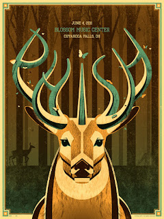
Terrible, Terrible, Terrible.

                                                          Oh deer.What is going on here?

It's hard to know what the message of this poster is. Because there's a date and a location, it's safe to assume that it's an event? But where can the viewer find more information when there isn't a phone number, email address, or social media link?

Also, the picture itself shows it's a cross breed between a unicorn and a deer? Is it their logo? Their icon?

Looking past all of that, the colors are the best part of this poster, each harmonizing with each other beautifully. The consistency of the color throughout is what makes this poster appealing, and using a unique border with these colors complement the inner content. Even the placement of the information is decent because the horns guide the viewer's eyes right to it. It's also aligned with the face of the animal, making this balanced from left to right.

But this is still a bad poster just because of the information it lacks. There could be many reasons why a music center would create a poster; a promotion, new location, a sale, etc. It leaves the viewer with too many questions as to why it exists at all.


                                                                        Where to begin?

TOO. MANY. FONTS.  There are five different fonts used on this poster. One is the logo of the company, and two are possibly sponsors? But it's a little font crazy and quite frankly, really font heavy as well.

The colors don't sit well with each other. It's stressful for the eyes to jump from a dark purple type to a lime green and then to the rest of the colors. There's also no color theme here, it's almost as if the designer opened the color palate, closed their eyes, clicked on a random spot, and used that color on their text.

Layout wise, putting two images (even if one is the icon/logo), on the left side of the page really makes the left side of the page heavier than the right.

There's also a lot of information put on this poster, making it overwhelming.

The content is also repetitive. If it's an amateur/rookie competition, it's not necessary to have "NO PROS!". Also, there's no need to say that there's two 9 ball events when the schedule is listed.

Also, the font in the upper right hand corner doesn't work with that small font size.

Did I miss anything?


Before there's mention of the type, the green flame is too much at the bottom. The designer, trying to match the flames in the "F"s at the top, uses too much of it and it's a distraction.

The sponsors should be listed at the bottom. Putting them in the middle of the page distracts from the main information.

There are a lot of web addresses listed at the bottom. Better separation and organization of where to buy the tickets and event information will clearly present the information in a less overwhelming way.

As for the top, from "A.K Promotions" to "KICKBOXING", the font size and the way it sits looks good. Although, the date and location should be separated from the title.

Why is there a blue tint on the kickboxing men? Using the normal colored photo would be better. The blue tint is kind of random.

Having a black background is tricky, making your eyes more sensitive to the brightness of color. So, this poster would be better if it had a white or a tinted background as opposed to the solid black. The white font would then be back and the colors wouldn't be so "in your face".

The fonts are all bold. Getting rid of the heaviness of all the type would also make the poster less dense.

Overall this is a heavy poster that seems to have all the content, but struggles with the organization of it and presentation of it.


Wednesday, September 2, 2015

Important Factors of Visual Communication in 500 Words

       I best respond to visual and written communication. When a process is shown to me, for example-fixing a flat tire, if the steps are demonstrated and there are written directions to refer to, it's easier to learn because, much like most written communication, the message can often be misinterpreted by the reader. With visual and written communication, they support each other creating a clearer message.

       Communication is best when the message is clear. That means the message and delivery must be  carefully executed. Where a message is being delivered visually, type and movement are very important.

       Type is crucial. Nobody is going to take the time to decipher a message that may be difficult to read at first glance. Although certain fonts may be associated with a logo, clear fonts are the safest way to deliver a message. It's essential to consider the people who may not speak English very well. Therefore, fonts that clearly show the letters and are clean of any "extras" is the best way to go.

      Movement is vital as well. The way somebody moves may send a message to somebody else. For example, someone may make a fist which usually shows that they're angry. Movement could show more than anything that could be written or said.  Also, let's not forget about sign language! Which I believe is a strong example of visual communication.

I feel many anti-bullying posters have a great sense of visual communication. For example these posters:                                        
        
The type is clear and in bold which makes the text heavy and immediately draws attention to the words. The size of the type is nice because it doesn't overpower the images. Colors impact the way the message is delivered, red being the severity and importance of the issue, and black and white to contrast.
Usually anti-bullying posters use images that may impact the viewer by making them feel sorrow or inspired. These posters  catch my eye every time, and the message is always the same yet executed differently. (Again, written and visual communication together create a strong message.)


Apple has strong visual communication with their logo. Not only is the image associated with the word (so you can never forget!) but the logo is consistent. Anything marked with this:                                                                   
whether in black or grey, if you're familiar with the brand or product, without a thought you'll know that it's a product of Apple. This, I believe, is the smart way to brand a product. Keep it consistent, clean, and clear.


Lastly, I believe traffic signs have strong visual communication. It's common to know that the green light means to go, the red octagon means to stop, and yellow signs refer to caution and awareness.  The rules of the road are communicated with drivers through shape, color and design. Sometimes there's type such as STOP or DETOUR but, again, the type is clear and bold for an easy, clear delivery of the message. The signs are also consistent, for example, stop signs are always red octagons.